

It should come as no surprise that mobile usage is on a quick path to take over desktop usage. In the past three years, mobile accounted for about 3% of website visits – now it’s 25-30% on average.
Think about how often you quickly search something on your smartphone, instead of waiting until you’re sitting down in front of your computer. We want instant gratification, and so your business website needs to instantly gratify your current and potential customers when they search you on their mobile device!
A stat by the Google Mobile Movement Study found that 88 per cent of consumers who search for a type of local business on a mobile device, call or go to that business within 24 hrs.
And if you need more reasons than that to have a mobile responsive website:
- You’ll be punished! It’s true, Google will punish you. And that giant is not someone you want on your bad side. Google ranks mobile-friendly sites higher than non-mobile friendly sites. That means your competitors who have responsive sites will appear higher in Google search results than your business.
- People won’t give you the time of day. Bounce rates are much higher for unresponsive sites because visitors get so frustrated. According to Google’s Think Insights, there is a 61% chance visitors will leave an unresponsive site immediately and go to another website (psst . . . another website is likely your competitors). People want to easily scan a site and get to the page with the information they want. You need to make the experience great for your customers, just like you do when they walk through the door of your business.
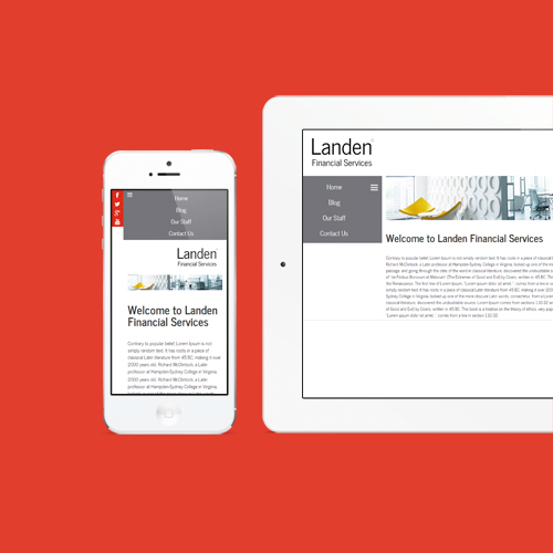
There are a number good practices when it comes to designing your mobile-friendly website. For example, build it for mobile first. That means as you design your website, don’t think about people viewing it from a desktop instead think about them viewing from a mobile device. Keep your content brief and have captivating images. And do NOT build a separate mobile site – that just causes extreme confusion.
As always, we’ve got your back at Mojito. At a flip of a switch, you can make your Mojito-powered website responsive to screens of all sizes no matter what monthly package you have – just make sure to switch the Mobile option to ‘on’!
